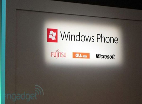
Microsoft Unveils New Windows Phone 7 Logo
What makes a logo? For some companies, a good logo can define their brand for decades; while other companies who haven’t had the same luck, find themselves needing a re-design every few years to, well, keep things fresh - and in Microsoft’s case, they’re doing just that. Over the course of the past week an interesting occurrence happened: the Windows Phone branding has shed the circle-based icon in exchange for a square-shaped variant, appropriately reflecting the platform’s “tile” look and minimalist theme.
I think the logo is a bit bland and doesn’t represent the “fresh” image Microsoft might be aiming for. Thoughts?
[via Engadget]


